Animation Fundamental - Project 1 & 2
Berlian Johanna / 0360054
Animation Fundamental / Bachelore of Design in Creative Media (Hons)
Project 1 & 2
Instructions
Project 1A- PRE-PRODUCTION FOR 2D ANIMATION PROJECT
- For this work progression 1, Set the character description (Age, Gender, Weight, Attitude, Personality) and design a character based on the information. You may take the character information from Film Studies and Cinematography class.
- Based on the study, use your creativity to come out with your own unique design by playing around with design elements. Remember it must look different from your references.
- Deliverables: A turnaround sheet (front, side, back and ¾ view perspective). Pose sheet (Various poses in different emotion) - 5 poses *full body. Character facial expressions - 5 expressions * focus on chest up.
- Your goal here is to create a character design that should reflect his or her personality in the story and be visually appealing to the targeted audience.
Reference :
Fig 1.1 FPE by Katie/@A3DGhost
I got inspiration from this artstyle, this is an animation by Katie about Fundamental Paper Education from the song BASIC IN BEHAVIOR. The animation was unique along with the artstyle but the target audience was not for kids during the trigger warning and stuff.
Fig 1.1a Fan animation by Kaatie
(Trigger warning! This animation fills with Blood and Gore, it is not targeted for young kids audience, for further information, there's a link to view the Original creator work!)
Fig 1.1b Fan animation by Niche-Ko
Fig 1.2 Credit by Zumo-Zuni
Fig 1.3 Face reference
Process of Making Character & Result! :
Fig 1.5 2nd Sketch
It all started with simple design inspiration from my clothes I wore back in the class. I add bubble chat because I was thinking she is good at communicating or the opposite. I was try to make original design character of student but then I change my mind.
Because I have seen a fan made of FPE original character design, it all started with some scary feature or disturbing for the teacher. I find it cool and so I make another design which I will focus it more.
Fig 1.6 1st Teacher sketch
Fig 1.6 2nd Teacher sketch
I repeat again for myself that thi character design was the corruption version as I making the very early design for Teacher Original character in FPE. After that I draw a reference for the simple look and character base view.
Fig 1.7 Final Character FPE OC reference.
OC is a stand of Original character. I have create the coloured version and the black, white grey version since the character art style that I learn was made of paper and add some color to make it interesting.
Fig 1.8 Clothes reference
Since it was a teacher, I decided to find several clothes reference for character making until I spotted this clothes which suitable for her characteristic and taste in clothing style.
Result :
Fundamental Paper Education Character Detail :
- Name : Ms. Ideka
- Age : 24
- Gender : Female
- Personality traits : Ambivert, mischief, perfectionist, Stubborn, Kind
- Internal features : calm, collected, sense of guilt, awkward.
- Ms. Ideka is a Senior Teacher, Teaching a subject about communication skills. Despite her major as a teacher was involving to be extrovert all the time she know she isn't confident with her own skill. Because of her perfectionist behavior, she find student with flaws was worrying. Unlike the other teacher, if the student fail her subject she gave a chance by private tutor or let them retake exam. She is very kind with compassion student who pay attention in her class, buth other student who isn't behaved well will facing the consequencesand harsh punishment.
Fig 1.9 Final Expressions Sheet
Following Ms. Ideka characteristic detail, I experiment her facial features. It seems I find it that this character was more into serious and stubborn looking then relaxed or positive smile. I even seperated some of the colouring since that is what this character shows, her expression a lot.
Fig 1.10 5 Poses Sheet
For the poses kinda having hard time which pose I will do but I just experiment and draw what I can do to apply in this poses sheet. I even combine some of the poses to make it as 2. So I guess I already nailed it.
Fig 1.11 Final Poses Sheet
Project 1B - PRE-PRODUCTION FOR 2D ANIMATION PROJECT (LAYOUT DESIGN)
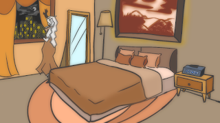
- For this work progression 2, you will be creating layout designs for an animated project using perspective. Your designs will be used as backgrounds for various scenes in the animation. Your goal is to create visually interesting and dynamic layouts that enhance the story and the mood of the animation.
- Choose a scene from the animation and create a rough sketch of the layout design using perspective. The sketch should show the placement of the background elements and characters in the scene. You can use traditional methods such as pencil and paper or digital tools such as a tablet and software.
- Refine the sketch into a more detailed line drawing. Add in the textures, shading, and other details that will bring the scene to life. Use the principles of perspective to create depth and dimension in the design.
- Create a colour study of the layout design. Choose a colour scheme that complements the mood and the theme of the scene. Experiment with different lighting scenarios and colour variations to create a visually compelling design.
Result :
Project 2A- Walk Cycle
- Study vanilla walk cycle that includes poses and timing from the book of Animator’s Survival Kit as a reference as these: Contact pose (3 frames), Down pose (3 frames). Pass pose (3 frames), Up pose (3 frames)
- Create a project in Adobe Animate. Set the setting as 24fps, 16:9 aspect ratio with 1280 x 720 (HD720p) resolution.
- Using the same character that you did in Project 1, animate the rough animation of that character, walking in the same spot at the side view. The rough animation process should be using basic form and sketchy stroke.
- The animation should show the quality of being appealing, fluid and flexible which you have mastered in the previous exercises. Output the rough animation as video with any of these format, *.mp4 format or quicktime *.mov. Create tie down drawing using a cleaner stroke.
Progress and Result :
Fig 2.2 Walk Cycle Rough Animation
Fig 2.3 Attempt on Walk Cycle
Fig 2.4 Final Walk Animation Compiled
Project 2B- Jump Animation
- Study jump animation that includes anticipation and follow through poses, timing with hold from the book of Animator’s Survival Kit as a reference as these: Normal pose, Anticipation pose, Jump action pose (Push off, On air, Landing),Follow through pose, Normal pose.
- Create a project in Adobe Animate. Set the setting as 24fps, 16:9 aspect ratio with 1280 x 720 (HD720p) resolution.
- The animation should show the quality of being appealing, fluid and flexible which you have mastered in the previous exercises.
Progress and Result :
Fig 3.2 Jump Cycle Rough Animation
Fig 3.3 Attempt on jump cycle
Fig 3.4 Final Jump Animation Compiled


.jpg)


Komentar
Posting Komentar