Information Design - Project 1 & 2
Berlian Johanna / 0360054
Information Design / Bachelore of Design in
Creative Media (Hons)
Project 1 & 2
Instructions
Flip W3: Miller's Law
Group Presentation.
Flip 3 (Group 4) - Miller's Law by Group 4
Project 1
Design Poster :
Project 2
An infographic poster for ONE recipe selected from Pasta Grannies. Study
one video, break down, and chunk the preparation and cooking process into
an instructable poster. Try to capture each Grandma’s personality and
unique dish identity in your poster as part of the narrative structure.
These infographics present complex information quickly and clearly, with
symbols charts, and diagrams. With an information graphic, computer
scientists, mathematicians, and statisticians develop and communicate
concepts using a single symbol to process information.
Your job is to transmit a set of instructions and at the same time educate
the audience. Infographics should be fun, it should simplify the context
while representing information graphically.
Because “A picture is worth a thousand words”. Yours should reflect the
following:
- To transmit or communicate a message.
- To present large amounts of information in a compact and easy-to-understand way.
- To reveal the data. Discovering cause-effect relations, knowing what’s happening.
- To periodically monitor the evolution of certain parameters.
You will develop an infographic to communicate a concept, topic, or idea -
IN THIS CASE A COMPLETE SET INSTRUCTION TO A RECIPE.
The infographic should take viewers visually through the information you
want them to learn or know. Based on your infographic the audience should
be able to learn through viewing and interpreting the various graphical
information and text.
You will be required to evaluate what parts of the topic, concept, or idea
are most important to tell/demonstrate and ask how you would represent
each piece of information best. You will also decide how to graphically
represent the most salient facts about your topic, concept, or idea for
student learning. This includes the finishing outcome which could be a
slick animation or even a rough stop motion.
Theoretical (Information Design Framework)
- Information type
- Device
- Principles (LATCH etc)
- Aesthetics i.e: isometric, simplified illustrations
Requirement: You will need to reflect the following (assessment
criteria):
Practical - photo editing/illustration software
- Graphs, charts, and diagrams
- Poster size: 1240 × 1750 pixels or 2048 × 2048 pixels
Process How I do my Assignment
I choose the video from Pasta Grannies channel for my Project 1
This is the link video I choose for making a poster of their recipe :
[ Pasta Grannies discover big ravioli called 'tortelli maremmani' ]
[ Pasta Grannies discover big ravioli called 'tortelli maremmani' ]
Tortelli Maremmani Recipe + Ingerdients + steps :
- 1 egg for every 100 gram of 00 flour
- She mix it until smooth the roll it out
- make a filling with the swiss chard that has been blanched & squeezed dry
- mix it with ricotta, salt, pepper, nut meg and 2 eggs
- add some parmigiano & check the seasoning.
- spoons out generous dollops of filling & folds over the pasta
- after creating pillows, use fork to seal the edges
- [tortelli maremmani fyi meant to be large, they made it for the yearly summer festivals celebrating served with a meat Ragu]
- Mince up celery, carrot, onion & fry the mixture and olive oil with a clove of garlic.
- crumble the sausages into the vegetables
- once this is cooked through, adds some minced beef.
- pour some white wine then add some tomato concentrate & homemade tomato passata.
- Leave the Ragu to simmer for at least an hour
- add tortelli to boling salted water & simmer them for around six mins
- Drain them on the tea towel & lay them with the review & parmigiano cheese, sparing them with the sauce
Image ingridients for reference :
Fig 1.1 00 flour
Fig 1.2 Nutmeg
Fig 1.3 Parmagiano
Fig 1.4 Ricotta
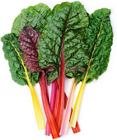
Fig 1.5 Swiss chard
Fig 1.6 Tomato concentrate
Progress :
Fig 1.7 Speedpaint progress how i sketch the structure poster
While I am making lots of sketches, it keeps rejected. the 1st reason
because complicated design, 2nd It didn't follow the instructure until I
try do research again from the Pasta Granny Video. Try to capture each
Grandma’s personality and then I notice it from the video ( 3 grannies
have different color apron ). So I am gonna use their apron color to
capture their personality. The poster structure I still gonna use it from
the speedpaint progress, but the design I will make sure it was suits
element with the 3 grannies personality.
Fig 1.8 "00 Flour"
Fig 1.9 "Carrot"
Fig 1.10 "Egg"
Fig 1.11 "Garlic"
Fig 1.12 "Nutmeg"
Fig 1.13 "Olive Oil"
Fig 1.14 "Onion"
Fig 1.15 "Parmigiano"
Fig 1.16 "Pasta"
Fig 1.17 "Pepper"
Fig 1.18 "Ricotta"

|
| Fig 1.19 "Salt" |
|
|
| Fig 1.20 "Sauce" |
Fig 1.21 "Sausage"
Fig 1.22 "Swiss Chard"
Fig 1.23 "Tomato Passata"
Fig 1.24 "Tomato Paste"
Fig 1.25 "Minced/Ground beef"
Fig 1. 26 Speedpaint Tortelli Maremmani Ingredients
I draw the materials on the IbisPaint for coloring and then when it was
finished I will edit in Adobe Illustration. It was fun for me to design
this in the simple way.
Process how I create a poster recipe about "Pasta Granny Tortelli
maremmani"!
Fig 1.27a "Structure I want to Use"
Fig 1.27b "Putting the work and edit in Adobe Illustator"
This is what my lecturere told me, the structure was fine but dont use
this element and I have to capture 3 Granny Personality. From every
sketches I create, I am choosing this one.
But I remove the cute design and replace it or do the changes for
following the requiered assignment. But I am not sure if what I was expecting can be follow up but I
hope my design isn't that bad since I am worry how it turns out for the
result.
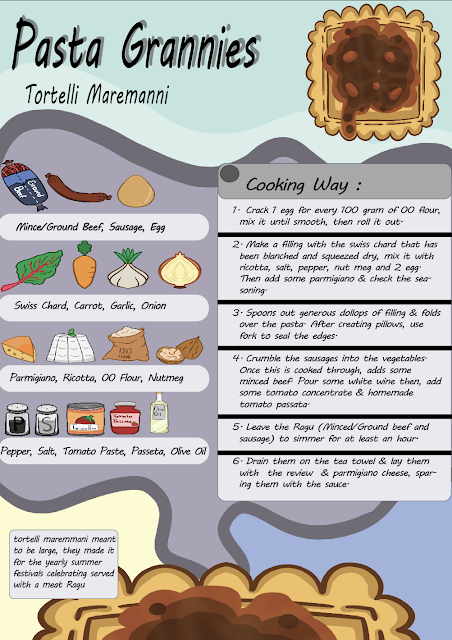
Fig 1.28 Poster Recipe (Pasta Granny- Tortelli Maremanni)
This is my design but I feel like the the exclamation marks maybe not
needed, in the end I removed it.
Fig 1.29 Poster Recipe (Pasta Granny- Tortelli Maremanni)
Fig 1.30 Poster Recipe (Pasta Granny- Tortelli Maremanni)
Further Information : Making Poster Pasta Granny! - Google Drive
I am not sure but I try my best to make it simple in order for me to
easy animate without feel difficult with the shading and the shape of
elements material that I made.
After talking and got the feedback, Things I need to fix :
1. Background
2. Title Typeface
3. Ingredients, label it properly.
4. Margin
Fig 1.31 Final Design Poster Recipe (Pasta Granny- Tortelli Maremanni)
I redesigned it in order to make it look nice unlike the old design. For
me, my weakness in designing poster is deciding the background. I need
to dive more about the design and find more inspiration.
Fig 1.32 Final Design Poster Recipe (Pasta Granny- Tortelli Maremanni)
Project 2
In progress, even I'm not experience in adobe, I tried.
I
try use my own old way that I ever go teached in my past semester. I even
put it extra editing using other app.
Fig 2.1 Story Board
This is my story board, I arrange and also try add some new featuresin order
to make it more nice and alive for this animation slide. I use Adobe Illustration for this and using old semester method to do animation.
New Feature I add :
I add a pan cooking the sauce base following the ingredients step to show
how sauce made for some certain page.
Fig 2.2 Pasta Granny Files
I saved every pages to make an animation movement called page-by-page in this file. It totals more then 100 pages and then I label it in order to avoid the confusion.
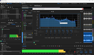
Fig 2.3 Process edit & animate
It is recommended to use Adobe, but not all features I know but I remember
some certain way how to do animation which is by "page to page" and "edit in
other app", while I edit the sound in there too. For the SFX and music
background I used Tiktok Audio since for me it was more nice and easy to be
found personaly.
For further Information it's all in Google Drive : Pasta Granny Animation - Google Drive
.gif)


.png)


-Pasta-Granny-Tortelli-Maremmani-Poster-Recipe.png)


Komentar
Posting Komentar