Interactive Design : Final Project - Creating a Single-Page Website for Your Favourite Artist
Berlian Johanna / 0360054
Interactive Design/ Bachelor of Design in
Creative Media (Hons)
Final Project - Creating a Single-Page
Website for Your Favourite Artist
Instructions
Final Project
Project Overview:
In this web design project, you will create a single-page website dedicated
to your favorite artist. This project will help you develop your web design
and development skills while allowing you to showcase your passion for the
artist of your choice.
Project Requirements:
Artist Selection: Choose your favorite artist as the subject of your
website. It can be a musician, painter, actor, or any other creative
individual or group. Ensure you have a genuine interest in the artist, as
this will help you create a more engaging website.
Content:
-
Your single-page website should include the following
sections:
Header with the artist's name and a brief tagline. -
Introduction:
Provide an overview of the artist's background and why you admire them. -
Biography:
Include a brief biography or description of the artist's life and career. -
Gallery:
Showcase images, videos, or other multimedia related to the artist's work. -
Contact Information:
If applicable, include contact details or links to the artist's social media profiles.
Design Elements:
Choose a color scheme and fonts that reflect the artist's style or your
personal taste.
Ensure a visually appealing layout with a balanced use of text and
multimedia.
Create a responsive design that adapts to different screen sizes
(mobile-friendly).
Navigation:
Implement smooth scrolling navigation or a simple menu that allows users to jump to different sections of the page.
Implement smooth scrolling navigation or a simple menu that allows users to jump to different sections of the page.
Interactivity:
Consider adding interactive elements such as image sliders, hover effects, or lightboxes for multimedia content.
Consider adding interactive elements such as image sliders, hover effects, or lightboxes for multimedia content.
Process
Fig 1.1 Sketch Idea
In this sketch idea, my lecturere approve but the elements too overwhelming.
The lecturer shows me the sample of the website and I can finaly made my own
version for the simple design and don't make it too complicated.
Link Inspiration Website Design :
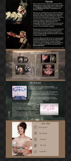
Fig 1.2 Design progress
First, I choose light brown colour and pink peach for synchronize with
my favourite artist aesthetic.
The time from her aesthetic was fairy or something like alice wonderland, I
have to match it. I add her official picture from the portal website
inspired from her official website. Then on the header I adds some menu
navigate such as Introduction, Biography, Album, Achievement and Media.
Fig 1.3 Adding the inside design progress
Second, I put the introduction from her official website wikipedia and the
last paragraph I wrote my reason to admire her.
Fig 1.4 The rest of the design
The rest of it I put same and also the source from wikipedia too and put
lots of effort in the design to make it very nice. But when the concept was
finished and showing to my lecturer, He suggest I need to removed some of
the picture because it's to overwhelming and distracting.
Fig 1.5 Another changes design
Because of it, I take the advice and remove some of the heavy picture or
elements to make it nice and not overwhelming for the eyes. The result was
nice and looks comfortable to see. I think I planned to not use the font
because it's too complicated so I stick with using helvetica.
Fig 1.6 Dreamweaver
When I apply to dreamweaver, lots of mistake happens here. When I try to fix
it, I stuck in the same loop especialy with fixing the image codes, links,
and the size of the desktop to make it not messy.
Fig 1.7 Index.html
I keep checking over an over again making sure nothing is mess up, except
since I copy paste from wiki pedia it means some of the words already
automatic jump link. So, I removed it and only leave something that connects
with my favourite artist creation.
Fig 1.8 Progress
This is the only part that I leaved it in order for the audience able to jump
link straight about Melanie's creation in her song information or project.
Fig 1.9 Hyperlink
I put hyperlink to linking this website and her official social media.
Fig 1.10 Hyperlink image
I put hyperlink to this image in order to be able interact to her official
website portal.
Fig 1.11 Navigation Link
I manage to create to navi link. However, the content is all mix up, causing
to not function properly. And it only takes you to the introduction. Code it
is not organized, the biography picture is together with the introduction
content so I have to fixed it.
Fig 1.11 Changes to reach succeed coding result
Because of the stressful event, I contact to my lecturer because of the coding
issue. In the end the lecturer gave the extension deadline until next week (
Tuesday, 12-12-2023 before midnight ).
With all of my might and courage, I ask someone for teach me while I have to
do it all over again since the coding issue. About the changes was from the
design detail even the font I changed using the default helvetica. After the
hard time event I manage to finish it.
Fig 1.12 HTML
Fig 1.13 CSS
This is the HTML & CSS code. For more further information or checking,
Here's my Google drive to check it more private : Interactive Design - Final Project - Google Drive
Link to the website I create :
MelaineMartinezFanpage
Relfection
Even though it was tough, I finished it. Thanks to everyone being patient, helping me, and checking for mistakes. I had to redo the website because of some problems, but after dealing with many issues and feeling stressed, I finally got it done. The support and help I got made a big difference. The website may not perfect, but hoping the result managed to fulfilled. Each flaws I made makes me proud the fact I manage to come this far and I should be proud of it.


Komentar
Posting Komentar